|
|
|
hildon-extras Reference Manual | |
|---|---|---|---|---|
                    HeCheckButtonPrivate;
                    HeCheckButton;
enum                HeCheckButtonArrangement;
enum                HeCheckButtonStyle;
GtkWidget*          he_check_button_new                 (HildonSizeType size,
                                                         HeCheckButtonArrangement arrangement);
GtkWidget*          he_check_button_new_with_text       (HildonSizeType size,
                                                         HeCheckButtonArrangement arrangement,
                                                         const gchar *title,
                                                         const gchar *value);
void                he_check_button_set_title           (HeCheckButton *button,
                                                         const gchar *title);
void                he_check_button_set_value           (HeCheckButton *button,
                                                         const gchar *value);
const gchar*        he_check_button_get_title           (HeCheckButton *button);
const gchar*        he_check_button_get_value           (HeCheckButton *button);
void                he_check_button_set_text            (HeCheckButton *button,
                                                         const gchar *title,
                                                         const gchar *value);
void                he_check_button_set_alignment       (HeCheckButton *button,
                                                         gfloat xalign,
                                                         gfloat yalign,
                                                         gfloat xscale,
                                                         gfloat yscale);
void                he_check_button_set_title_alignment (HeCheckButton *button,
                                                         gfloat xalign,
                                                         gfloat yalign);
void                he_check_button_set_value_alignment (HeCheckButton *button,
                                                         gfloat xalign,
                                                         gfloat yalign);
void                he_check_button_add_title_size_group
                                                        (HeCheckButton *button,
                                                         GtkSizeGroup *size_group);
void                he_check_button_add_value_size_group
                                                        (HeCheckButton *button,
                                                         GtkSizeGroup *size_group);
void                he_check_button_add_size_groups     (HeCheckButton *button,
                                                         GtkSizeGroup *title_size_group,
                                                         GtkSizeGroup *value_size_group,
                                                         GtkSizeGroup *image_size_group);
void                he_check_button_set_style           (HeCheckButton *button,
                                                         HeCheckButtonStyle style);
HeCheckButtonStyle  he_check_button_get_style           (HeCheckButton *button);
void                he_check_button_toggled             (HeCheckButton *button);
void                he_check_button_set_active          (HeCheckButton *button,
                                                         gboolean is_active);
gboolean            he_check_button_get_active          (HeCheckButton *button);
  GObject
   +----GInitiallyUnowned
         +----GtkObject
               +----GtkWidget
                     +----GtkContainer
                           +----GtkBin
                                 +----GtkButton
                                       +----HeCheckButton
  "arrangement"              HildonButtonArrangement  : Write / Construct Only
  "size"                     HildonSizeType        : Write / Construct Only
  "style"                    HildonButtonStyle     : Read / Write
  "title"                    gchar*                : Read / Write
  "value"                    gchar*                : Read / Write
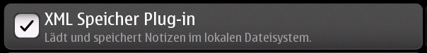
HeCheckButton combines the two labels of a HildonButton with the finger-sized check box of a HildonCheckButton.
The height of a HeCheckButton can be set to either "finger" height or "thumb" height. It can also be configured to use halfscreen or fullscreen width. Alternatively, either dimension can be set to "auto" so it behaves like a standard GtkButton.
A HeCheckButton shows a checkbox and contains two labels, named title and value. The contents of the button are packed together inside a GtkAlignment and they do not expand by default (they don't use the full space of the button).
To change the alignment of both labels, use gtk_button_set_alignment()
To make them expand and use the full space of the button, use
he_check_button_set_alignment().
To change the relative alignment of each label, use
he_check_button_set_title_alignment() and
he_check_button_set_value_alignment().
Example 1. Creating a HeCheckButton
void
button_clicked (HeCheckButton *button, gpointer user_data)
{
    const gchar *title, *value;

    title = he_check_button_get_title (button);
    value = he_check_button_get_value (button);
    g_debug ("Button clicked with title '%s' and value '%s'", title, value);
    g_debug ("Button is: %s", he_check_button_get_active (button) ? "Active" : "Inactive");
}

GtkWidget *
create_button (void)
{
    GtkWidget *button;
    GtkWidget *image;

    button = he_check_button_new (HILDON_SIZE_AUTO_WIDTH | HILDON_SIZE_FINGER_HEIGHT,
                                HE_CHECK_BUTTON_ARRANGEMENT_VERTICAL);
    he_check_button_set_text (HE_CHECK_BUTTON (button), "Some title", "Some value");

    gtk_button_set_alignment (GTK_BUTTON (button), 0.0, 0.5);

    g_signal_connect (button, "clicked", G_CALLBACK (button_clicked), NULL);

    return button;
}
typedef enum {
   HE_CHECK_BUTTON_ARRANGEMENT_HORIZONTAL,
   HE_CHECK_BUTTON_ARRANGEMENT_VERTICAL
}                                               HeCheckButtonArrangement;
Describes the arrangement of labels inside a HeCheckButton
typedef enum {
   HE_CHECK_BUTTON_STYLE_NORMAL,
   HE_CHECK_BUTTON_STYLE_PICKER
}                                               HeCheckButtonStyle;
Describes the visual style of a HeCheckButton
HE_CHECK_BUTTON_STYLE_NORMAL
|
The button will look like a normal HeCheckButton |
HE_CHECK_BUTTON_STYLE_PICKER
|
The button will look like a HildonPickerButton |
GtkWidget*          he_check_button_new                 (HildonSizeType size,
                                                         HeCheckButtonArrangement arrangement);
Creates a new HeCheckButton. To set text in the labels, use
he_check_button_set_title() and
he_check_button_set_value(). Alternatively, you can add a custom
child widget using gtk_container_add().
size : |
Flags to set the size of the button. |
arrangement : |
How the labels must be arranged. |
| Returns : | a new HeCheckButton |
GtkWidget*          he_check_button_new_with_text       (HildonSizeType size,
                                                         HeCheckButtonArrangement arrangement,
                                                         const gchar *title,
                                                         const gchar *value);
Creates a new HeCheckButton with two labels, title and value.
If you just don't want to use one of the labels, set it to
NULL. You can set it to a non-NULL value at any time later using
he_check_button_set_title() or he_check_button_set_value() .
size : |
Flags to set the size of the button. |
arrangement : |
How the labels must be arranged. |
title : |
Title of the button (main label), or NULL
|
value : |
Value of the button (secondary label), or NULL
|
| Returns : | a new HeCheckButton |
void                he_check_button_set_title           (HeCheckButton *button,
                                                         const gchar *title);
Sets the title (main label) of button to title.
This will clear any previously set title.
If title is set to NULL or an empty string, the title label will
be hidden and the value label will be realigned.
button : |
a HeCheckButton |
title : |
a new title (main label) for the button, or NULL
|
void                he_check_button_set_value           (HeCheckButton *button,
                                                         const gchar *value);
Sets the value (secondary label) of button to value.
This will clear any previously set value.
If value is set to NULL or an empty string, the value label will
be hidden and the title label will be realigned.
button : |
a HeCheckButton |
value : |
a new value (secondary label) for the button, or NULL
|
const gchar* he_check_button_get_title (HeCheckButton *button);
Fetches the text from the main label (title) of button,
as set by he_check_button_set_title() or he_check_button_set_text().
If the label text has not been set the return value will be NULL.
This will be the case if you create an empty button with
he_check_button_new() to use as a container.
button : |
a HeCheckButton |
| Returns : | The text of the title label. This string is owned by the widget and must not be modified or freed. |
const gchar* he_check_button_get_value (HeCheckButton *button);
Fetches the text from the secondary label (value) of button,
as set by he_check_button_set_value() or he_check_button_set_text().
If the label text has not been set the return value will be NULL.
This will be the case if you create an empty button with he_check_button_new()
to use as a container.
button : |
a HeCheckButton |
| Returns : | The text of the value label. This string is owned by the widget and must not be modified or freed. |
void                he_check_button_set_text            (HeCheckButton *button,
                                                         const gchar *title,
                                                         const gchar *value);
Convenience function to change both labels of a HeCheckButton
button : |
a HeCheckButton |
title : |
new text for the button title (main label) |
value : |
new text for the button value (secondary label) |
void                he_check_button_set_alignment       (HeCheckButton *button,
                                                         gfloat xalign,
                                                         gfloat yalign,
                                                         gfloat xscale,
                                                         gfloat yscale);
Sets the alignment of the contents of the widget. If you don't need
to change xscale or yscale you can just use
gtk_button_set_alignment() instead.
Note that for this method to work properly, the child widget of
button must be a GtkAlignment. That's what HeCheckButton uses by
default, so this function will work unless you add a custom widget
to button.
button : |
a HeCheckButton |
xalign : |
the horizontal alignment of the contents, from 0 (left) to 1 (right). |
yalign : |
the vertical alignment of the contents, from 0 (top) to 1 (bottom). |
xscale : |
the amount that the child widget expands horizontally to fill up unused space, from 0 to 1 |
yscale : |
the amount that the child widget expands vertically to fill up unused space, from 0 to 1 |
void                he_check_button_set_title_alignment (HeCheckButton *button,
                                                         gfloat xalign,
                                                         gfloat yalign);
Sets the alignment of the title label. See also
he_check_button_set_alignment() to set the alignment of the whole
contents of the button.
button : |
a HeCheckButton |
xalign : |
the horizontal alignment of the title label, from 0 (left) to 1 (right). |
yalign : |
the vertical alignment of the title label, from 0 (top) to 1 (bottom). |
void                he_check_button_set_value_alignment (HeCheckButton *button,
                                                         gfloat xalign,
                                                         gfloat yalign);
Sets the alignment of the value label. See also
he_check_button_set_alignment() to set the alignment of the whole
contents of the button.
button : |
a HeCheckButton |
xalign : |
the horizontal alignment of the value label, from 0 (left) to 1 (right). |
yalign : |
the vertical alignment of the value label, from 0 (top) to 1 (bottom). |
void                he_check_button_add_title_size_group
                                                        (HeCheckButton *button,
                                                         GtkSizeGroup *size_group);
Adds the title label of button to size_group.
button : |
a HeCheckButton |
size_group : |
A GtkSizeGroup for the button title (main label) |
void                he_check_button_add_value_size_group
                                                        (HeCheckButton *button,
                                                         GtkSizeGroup *size_group);
Adds the value label of button to size_group.
button : |
a HeCheckButton |
size_group : |
A GtkSizeGroup for the button value (secondary label) |
void                he_check_button_add_size_groups     (HeCheckButton *button,
                                                         GtkSizeGroup *title_size_group,
                                                         GtkSizeGroup *value_size_group,
                                                         GtkSizeGroup *image_size_group);
Convenience function to add title, value and image to size
groups. NULL size groups will be ignored.
button : |
a HeCheckButton |
title_size_group : |
A GtkSizeGroup for the button title (main label), or NULL
|
value_size_group : |
A GtkSizeGroup group for the button value (secondary label), or NULL
|
image_size_group : |
A GtkSizeGroup group for the button image, or NULL
|
void                he_check_button_set_style           (HeCheckButton *button,
                                                         HeCheckButtonStyle style);
Sets the style of button to style. This changes the visual
appearance of the button (colors, font sizes) according to the
particular style chosen, but the general layout is not altered.
Use HE_CHECK_BUTTON_STYLE_NORMAL to make it look like a normal
HeCheckButton, or HE_CHECK_BUTTON_STYLE_PICKER to make it look like
a HildonPickerButton.
button : |
A HeCheckButton |
style : |
A HeCheckButtonStyle for button
|
HeCheckButtonStyle he_check_button_get_style (HeCheckButton *button);
Gets the visual style of the button.
button : |
A HeCheckButton |
| Returns : | a HeCheckButtonStyle |
void he_check_button_toggled (HeCheckButton *button);
Emits the "toggled" signal on the HeCheckButton. There is no good reason for an application ever to call this function.
button : |
A HeCheckButton |
void                he_check_button_set_active          (HeCheckButton *button,
                                                         gboolean is_active);
Sets the status of a HeCheckButton. Set to TRUE if you want
button to be 'pressed-in', and FALSE to raise it. This action
causes the "toggled" signal to be emitted.
button : |
A HeCheckButton |
is_active : |
new state for the button |
gboolean he_check_button_get_active (HeCheckButton *button);
Gets the current state of button.
button : |
A HeCheckButton |
| Returns : | TRUE if button is active, FALSE otherwise.
|
"arrangement" property"arrangement" HildonButtonArrangement : Write / Construct Only
How the button contents must be arranged.
Default value: HILDON_BUTTON_ARRANGEMENT_HORIZONTAL
"style" property"style" HildonButtonStyle : Read / Write
Visual style of the button.
Default value: HILDON_BUTTON_STYLE_NORMAL
"title" property"title" gchar* : Read / Write
Text of the title label inside the button.
Default value: NULL
"value" property"value" gchar* : Read / Write
Text of the value label inside the button.
Default value: NULL
"toggled" signalvoid user_function (HeCheckButton *arg0, gpointer user_data) : Run First
Emitted when the HeCheckButton's state is changed.
user_data : |
user data set when the signal handler was connected. |